GOLDEN DAGGER REBRAND
Golden Dagger was a small venue in Chicago, IL showcasing local and nation-wide music in Lincoln Park. After a long talk with the owner, I convinced him the place needed a re-brand to catch some new eyes and interest. My goal was to bring in more color, dynamic movement and typography to make the brand more exciting and draw the customer eye.
SPECIALS POSTER
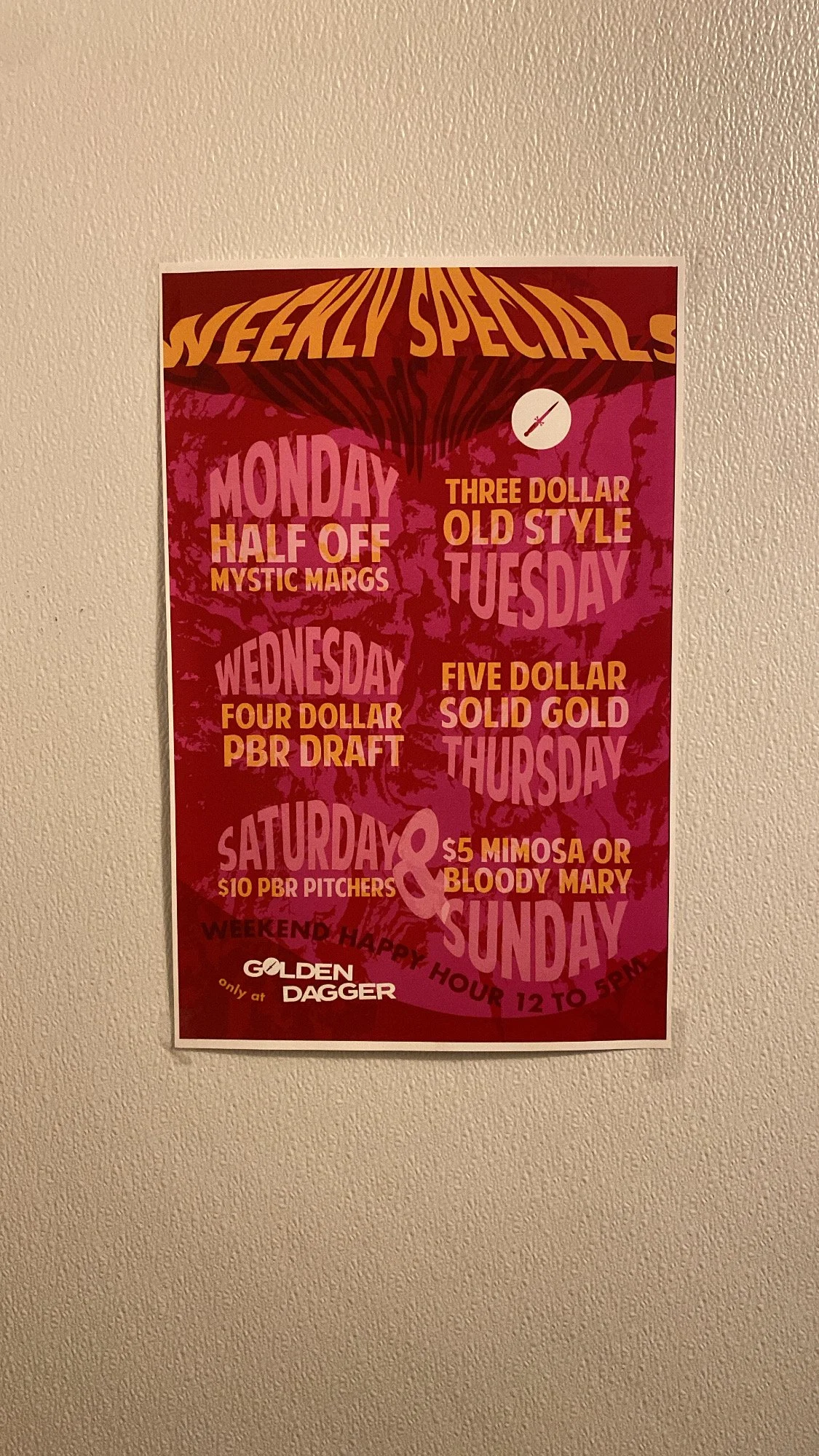
Color, texture, and typography were all things I wanted to bring to the Golden Dagger brand. The old cold, corporate look was not representative of what the Dagger actually was. So I brought some fun to it.

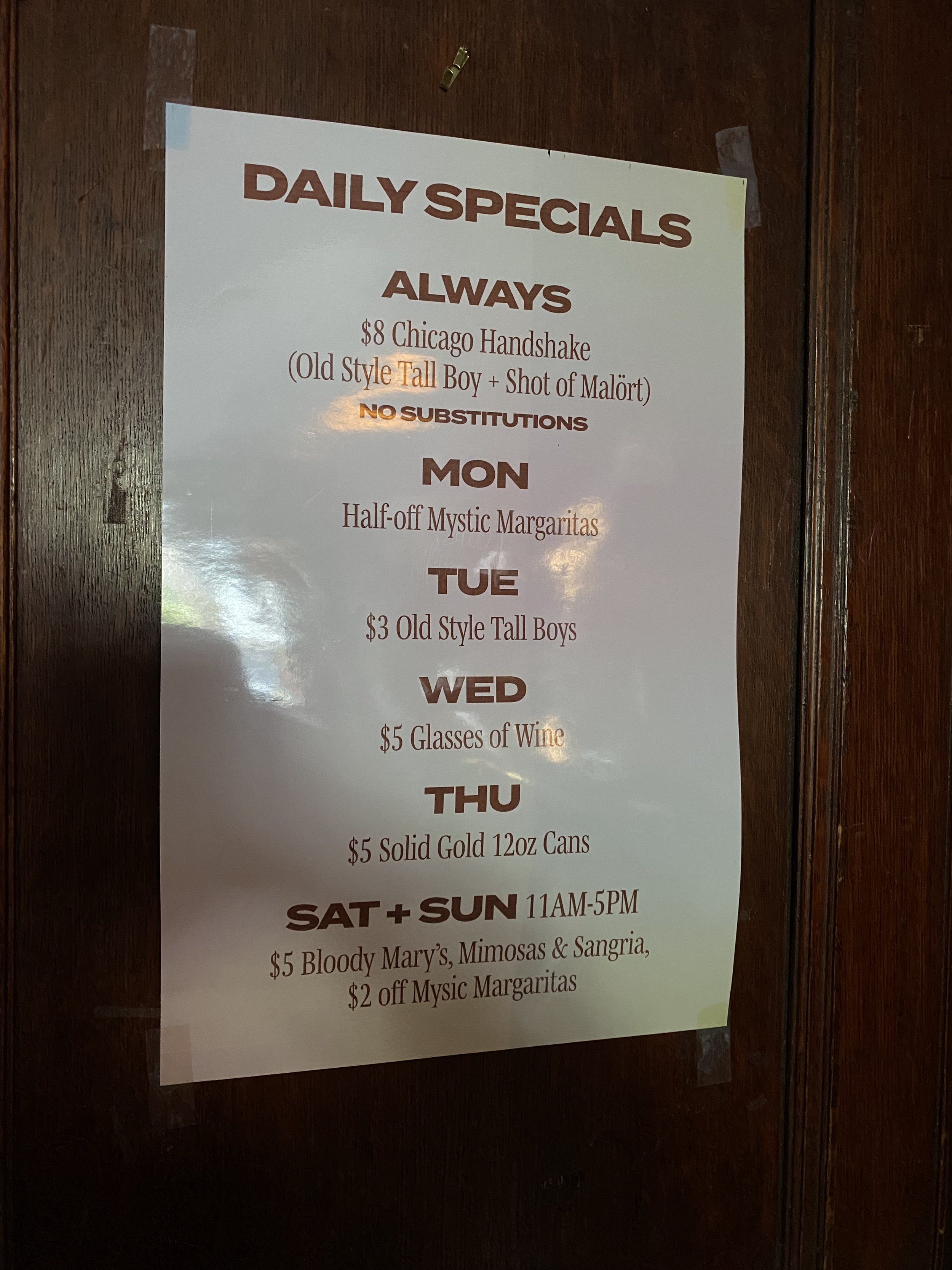
before
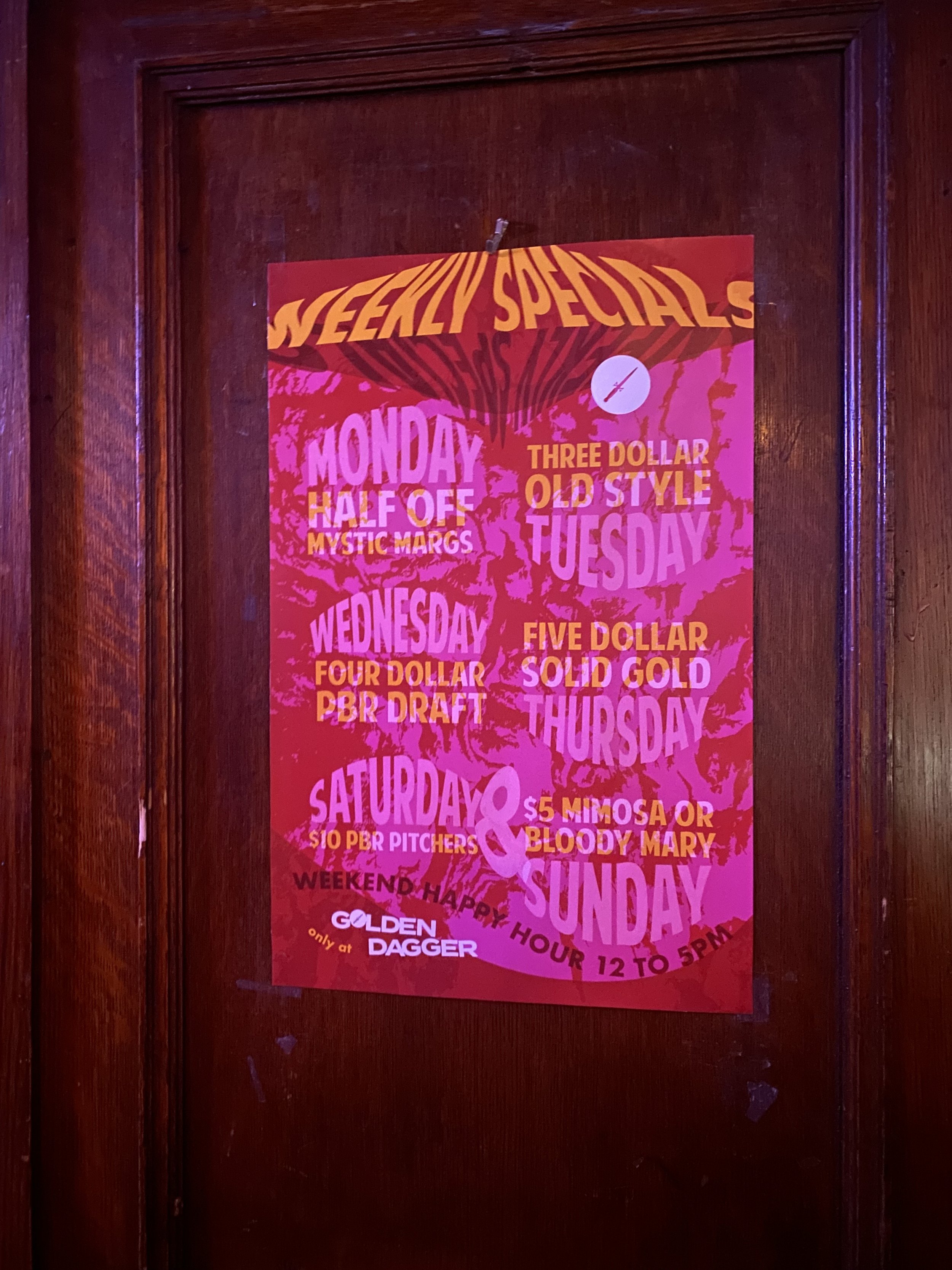
after

INSTAGRAM SLIDES
Golden Dagger not only needed consistent socials, but it needed consistent socials that made the viewer stop scrolling. The simplicity of the old flyers made them easy to read, but often wouldn’t catch the younger viewer. I wanted to change that and bring a look that was specific to the Dagger.


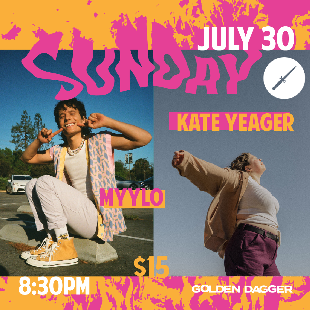


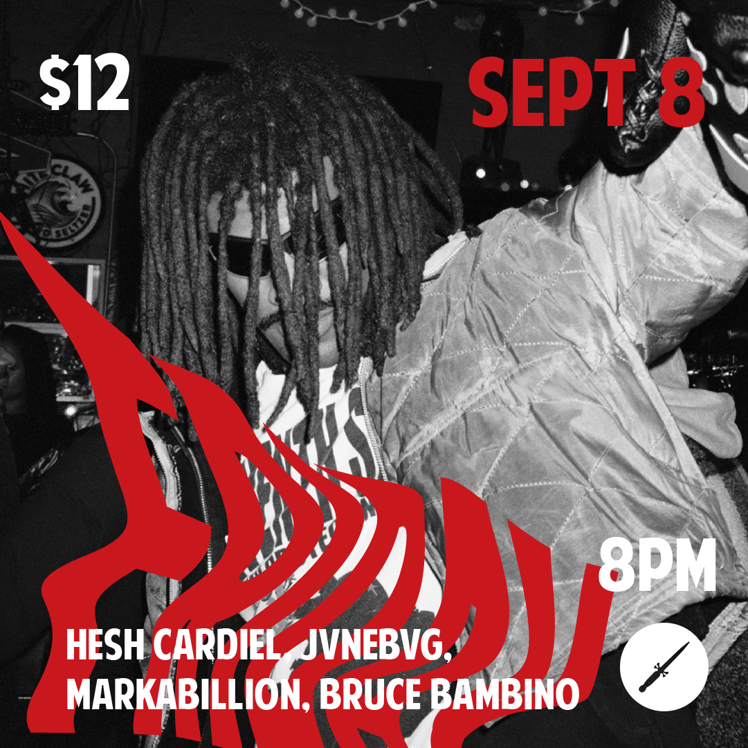
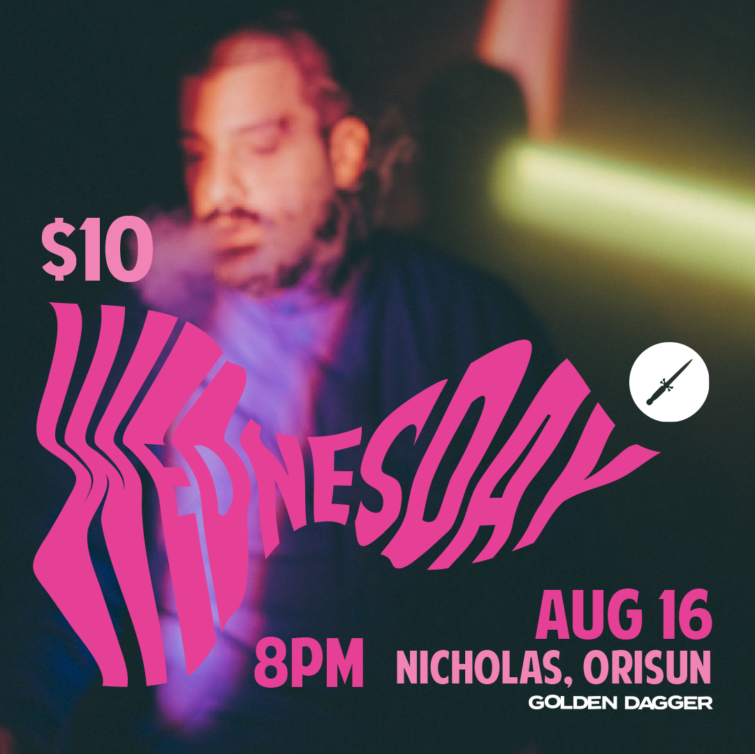


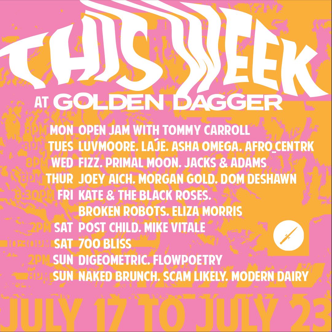
Weekly shows post
For venues I am a strong believer of a “weekly shows” post which Golden Dagger was not doing before. I wanted all important information to be on the post, while still giving it a little edge and keeping to the branding of the other work I was making.

